i review my old art. i originally typed it in a notepad++ file so ill probably mess up the formatting somewhere. i guessed i should post somewhere maybe. having finished i feel it was a waste of time but whatever. i WANT to go and fix everything but i dont think it would be a wise use of time. cough commission me for art/sprites
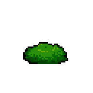
fish
good, shoulder shading could be better
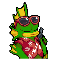
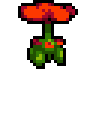
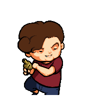
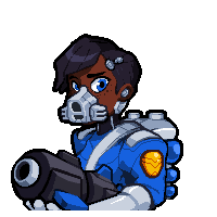
c - vacation i do like this skin but it was done pretty poorly. i had trouble animating the shirt and glasses and felt the need to change fish's colors
-fish skin is to red. i did this on purpose but it looks off. might be the contrast -the hand with the gun is at a weird angle. it seems unnaturally close to the body -inner 'ear' line isnt angled with the rest of the head -the first top fin section doesnt line up with the other 2 -mouth is slightly bulbous on the right
im not going to edit everything here but i started editing this image before deciding to type all of this and had it open
bottom right of the shirt seems to flicker
sunglasses bounce to rapidly, face seems stiff
top right orange and bottom right white orphaned pixels, top of mouth should have some highlights
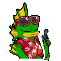
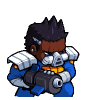
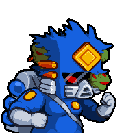
d - grunt
i am happy with it there is a blue pixel on the outside of the gun outline(it is hidden in game), i honestly cant remember if i added it on purpose as a refference to rogues blue pixel
hair should be curved when bouncing more both horizontally and vertically
green bg should be hidden, hair should be curved a bit more near the ear
crystal
mouth shine seems off
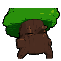
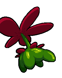
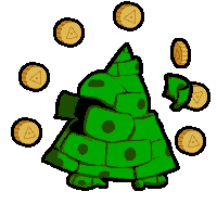
c - tree one of my favorite
-tip of the nose outline seems to abruptly end when it crosses the forehead instead of fading into dark brown -leaves should be textured much more
-spawning smear frame could be much better
d - shielder the faces for its sprites, portrait and map/loadout seem to be 3 seperate characters
head/face should be changed to more closely resemble the sprite/character icon
eyes bad
eyes
glasses are to small
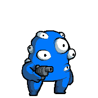
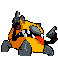
c - blob
eyes are to symmetrical. the large eye on the right should be lowered and the one below it removed
the shoulder eye pupil shouldnt smear while bobbing
the shoulder eye moves to much central eye shape is inconsistant with the rest of the art
d - inspector
i should have just kept the hair full size. probably shouldnt try to draw the eyes
he would benefit from having 2 walk animations based on direction very much, its very strange in game as is face seems to narrow i think the right eye is to close eyebrows and forehead are strange
melting
center mound on forehead doesnt read well with the bottom only being dark over the flesh
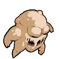
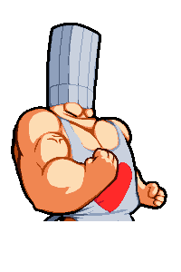
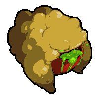
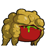
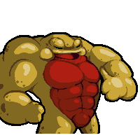
c - glob this one is by far the worse ive done
i think the face itself is good but the general pose and the fleshy mounds around the face all seem off. the shading on the shoulder is bad. as is the ones on top of the head. generally want it to more closely look like the map and loadout images head shading is bad but i like the shapethe shoulder shape and shading is really badugghhh just look at it the legs change size from the idle the flapping arm i hate it d - necromancer the portrait is the worst part of this skin the eyes should be more uniform i dont like the pose but it fits the character select screen pretty well i would remove or heavily change the arms maybe giving a gun the shape of the hood is a bit to round around the sides head bounce is a little off at the front top but im okay with it
i think he should have changed effects for blood explosions, like leaving fading revive circles over the scorchmarks plant this boy, my heart c - sapling good concept could be executed better way to much perspective the shading is bad the neck petals dont seem evenly placed the top edge of the middle petal should have some sort of outline middle leg should be centered more and not be lower than the others petals seem to sway vertically to much when it spins it should rise a frame or 2 more abruptly and fall a bit slower
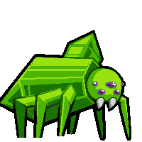
custom draw for weapons to follow its bobbing? d - spider one of the oldest pose is boring, i dont like the legs, fangs arent centered, eye shine should be faded a bit on the edgeshead should be more circular back leg is a little strange could use a bit of line width correction yv sured - jw front hand and wrist are to small and back hand is a raptor hand his jowls and cheekbones are different sizes hair could use a bit more shading face should be closer to the loadout image and not use single dots for eyes beacuse that automatically = bullets from gungeon now generally looks off the legs seem to thick at the hips and in some frames the feet are 2 pixels wide. shorts dont move like shorts bobs weirdly steroids bad, head and back shape should be more like A, head seems to slope forwardc - chef bad arm anatomy note how i didnt feel the need to change steroids color palette like i felt i did for fishC and its fine shading on the back of the head seems really weird i think i was trying to keep the bg color in to much and he should be leaning more forward
the wiggle of the hat should be 2 or 3 pixels lower
d - mimic
give tongue siliva again with wanting to have the characters bg color show and using a bad pose
the angle on the back left corner should be sharper
robot
top of eye could be shaded better
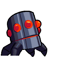
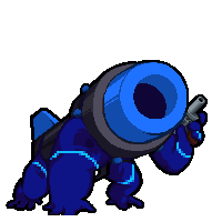
d - turret
pretty bad way to much perspective going on the highlights dont seem parallel the eyes shape in inconsistent the top is smooth while the separate parts have separate shading
i like the idle animation but think the whole thing would benefit from being 2-4 pixels bigger than the a/b skins
chicken
i mirrored it and colored the eye
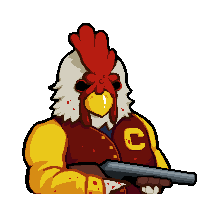
c - jacket
the body is to big compared to every other portrait the shotgun shading seems really flat
he is to small, face looks smushed
top corners of the head are to bulbus
the back of the ...hair? moves strangely when walking chicken head could be brought up a pixel or 2
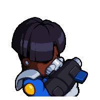
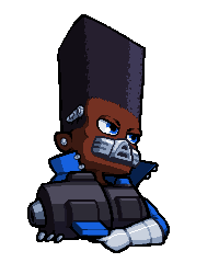
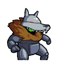
d - bot
rushed with quick lazy shading. hands are a joke
looks strange when the fur blows upward and the bottom is rounded
rebel
i dont like the bit of coat showing on the left wrap seems to be strangely angular at the top right
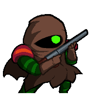
c- jungle
shading is rough hand on the right is small i really dont like the way i did the shoulder pads
top right bg pixel the neck wrapping is bad
the shoulder seems to snap between idle and walk. not sure which should be changed
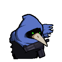
d - raven
the shading on the side of the hood makes it shape different from the sprite and icon i should have doubled the walkcycle and animated the cloth better
horror
the pink rings dont feel right
c - plasma
the way i shaded some corners makes certain lines seem unparellel to the rest like fishC the gun is held unnaturally close to the body i like the blocky cyan rings but on the character select screen the few pieces of them visible look out of place
its to low
barrel should be bigger
the pulsing rings dont seem correct for the back legs
i should probably have tripled the walkcycle and made the legs pulse the bright blue pixel on the top of the back leg seems to disappear and reappear the right most leg jumps forward to much
d - moni very old sprites
the moni could use more detail i dont like the smushed circle on the left certain moni should be behind other moni
it should just be a moni tile
the tip is angled weird the body could be 1 pixel forward
rogue
bad bad pose gun is straight head is to small
c - justin chan rogue art
kinda bad i dont like symetrical icons gun seems a bit long
her hair should have more volume/shape as is her shape really isnt the same as the concept art its supposed to be back of hair should be lower and front should be more forward
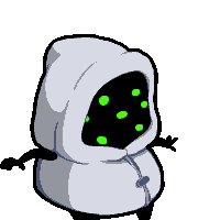
d - freak
the broken gold thing on the side of her head should only be one part its distracting and unnecessary
the freak eye should be more open
skeleton
okay
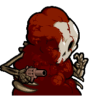
c- blood
the blood/meat doesnt really know if it want to be blood or meat the shading is a bit inconsistent the pose doesnt fit around the select name well
missing the blood mound on the top in the portrait shinny blood
skull pillow shading shinny blood chin? bottom blood goes down to much
i would redo completely and make him hobble more top rib shouldnt be there, if it is it should be rotated blood hair doesnt really move with the skull legs move to much. i know i wanted it to be basically be melting walk but its not really working
d - maggot
head is pointy teeth should all point towards the center top right seems weird
frog
b - super
this was one of my first nt portraits i ever did the shading of the side is bad shading under the right eye is weird
c - daughter
the right eye has something weird going on with the outline. not sure why i did that. the inner outline color lining the black outline the left cheek/ front hip are shaped strange its legs get fatter when running i really dont like it standing still it should jog in place slightly d - buff OwO his fingers could be better
i dont like symetrical icons
his face/mouth should read better
Files
skinpack by blaac v3.1.zip639 kB
Aug 04, 2018
icons.mod.gml (replace with this for ntt9921)22 kB
May 17, 2018
unlock conditions txt file (you cant see conditions when playing co-op)1.2 kB


Comments
Log in with itch.io to leave a comment.
Fucking delightful.